Thursday 28 March 2013

Distressed Queen Bee - EWV MAC #7

2nd one for the day - multi-tasking here in Bristol!!

This fortnight's Everything Wendy Vecchi challenge was to produce something with Distress Embossing Powder, with at least one WV stamp.  I had some fun with this!!

Started with a door hanger thingie from my stash.  Got my distress stains out to cover the background, and the art part frame and bee.  Stamped the bee, and then blinged her wings up a little with some holographic foil I had in the stash, but never got round to using!!

I stamped the frame with that lovely honeycomb stamp in fired brick and then covered it with the fired brick distress embossing powder - background still a little damp, so the embossing powder stuck a bit randomly.  Clearly, I planned for this!!

I had a crown brad in my stash, which got the alcohol ink treatment, and its legs chopped off, so it could be stuck to the queen.

Finally the sentiment stamped out, and cropped, with the was underlined.

Enjoy!


Materials
Inks:
Archival - Jet Black, Monarch orange
Distress Inks - Fired brick, Black soot
Distress Stain - Wild honey, Mustard seed, Picket fence
Adirondak Alcohol Ink - Gold mixative
Art Parts:
Frame, Bee
Stamps:
Art fit for a Queen (LCS040)
Art for you (LCS093)
Bling:
Holographic tape


Shiny Happy People - Hels' Challenge

Af'noon all!  Flaming cold here in Bristol.  Not venturing out.  Is it really the start of Bristish Summer Time at the weekend?  Those poor little bunnies will be cold...

Anyway, taken the opportunity to do a tag for Hels' challenge which this week is Shiny Happy People - will she ever pick a song I don't like?!  Apologies for the photos for this challenge - too much bling, not picking up well.


Standard tag from stash, swooshed with Decoart Americana acrylic and dried.  Covered over with the first layer of bling, an artists' irridescent medium.  Then used the smaller version of the dancing children from IndigoBlu - the children (AKA people) look happy to me.  To make them shiny, I used some holographic embossing powder.

Right then it gets really blingy!  Amazing Viva Decor Crystal gel - never used it before, but ooooh, think I'll be using it again!!  Smeared it across the top of the tag with a pallette knife, and then set some tiny square mirror tiles into the gel.  Finished it off with some ribbon smooshed through Dylusions spray and Cosmic Shimmers peal spray - so a little shiny!

Believe you me, in real life this tag is bling-tastic, Bling City central, and frankly, a bit over the top!!


Materials:
Paint: DecoArt Americana - Bubblegum pink, Pistachio green
Ink: Brilliance - Lightening black; Dylusions spray - Bubblegum Pink
Bling: Cosmic Shimmer Spray - Pearl; Viva Decor Crystal Gel (Kristall-gel) 001; mirror tiles from stash


Tuesday 26 March 2013

P is for... Craft Barn Alphabet challenge

2nd one for the day!  It really is cold outside, so I am not venturing out!!

The Craft Barn (near Gatwick) set a fortnightly challenge based on the alphabet.  This is my first time entering, but I will play catch up, or it will be really sacreligious to deface a Dictionary for just one challenge!  I'm making up a binder for these, and so all of them will be 6 x 6, or will fit into that format (well, there may be some origami at a later date!!)

P is for Pachyderm, Paisley and Pansy in this example, and I used predominantly Pink and Purple too, just to keep to the theme.
The paper is a My Mind's Eye one, and I picked some of the pattern out in lime green to give it a bit more contrast. I stamped the lovely curly P in the corners in deep Purple.
I made up the Pocket (or maybe it's a Pouch?) and stamped it with the Pansies from Darkroom Door, and then touched it up with a little cosmic shimmer watercolour paint.  When dry I went over it with a little Picked raspberry DI.

The tag is coloured with Picked raspberry and shaded lilac, and freckled with water.  Then I stamped the Pachyderm (elephant to you!) slightly off the tag in tuxedo black memento, so he stands out.  The ribbon is coloured with the same two DIs, with a little cosmic shimmer spray in Pearl.

When I make up the rest of the challenges, I'll need to know what's where, so I added a tag, with a wooden P glued on.

Finally, I cut into the Dictionary (I could feel the pounding of the book Police's hobnail boots behind me), and stuck on the three definitions, to comply with the rules of the challenge.

Hope you like my Pachyderm!

Materials used:
Paper: My Mind's Eye
Stamps: Stampin' Up - P; Stamper's Anonymous - Pachyderm; Darkroom Door - Pansies;
Inks: Distress Ink - Picked Raspberry, Shaded Lilac; Memento - Tuxedo Black; Archival, Deep Purple;
Bling: Cosmic Shimmers - Watercolour and Mist

Curiouser and curiouser - IndigoBlu challenge

Hi there!

Today I am hoping that this cold weather will go, so I can try to mow the lawn, but it seems we are stuck with it till after Easter - but at least, here in Bristol, no snow!  Small mercies!


So, here is my entry for the IndigoBlu Challenge no 2, Words and phrases. I love the Alice stamps, I have both sets, and regularly use the phrase Curiouser and curiouser at work - it seems to fit so many occasions and situations, at least on the projects on which I work!! 


I started my using Distress inks to make a background, and used the larger watch face over the top, 2nd generation stamping, along with curiouser and curiouser. Also the crackle stamp from Alice is on there, hand stamped.


Then I stamped on another piece of card the mad hatter, and used my water brush to pull the vintage photo ink out across the stamp. There is just a touch of glossy accents on the 10/6 ticket in his hat!


I also stamped the larger watch again, and added a little glossy accents to highlight the centre and the edge, but left the bezel (well, I think it's called the bezel!) uncovered.  This has been mounted on linen card edged with vintage photo.


The last piece of stamping (No wonder you're late....) also went on this linen tetured card, punched out and edged with vintage photo. I did a little doodling with wild honey.  Doodling isn't really my forte...


Put it all together with some american crafts twine, and matted and layered with some black and sunshine yellow/orange card from my stash.  The finished piece would go on an 8 x 8 card.

Hope you like it!  Think it would make a good card for a 'whoops, sorry I forgot your birthday' card!


Supplies:
Stamps
IndigoBlu:  Alice I and Alice II, Take the time
Inks:
Distress Ink pads - Vntage photo, Old paper, Tea dye, Frayed burlap.
Distress Ink marker - Wild honey
Other:
Ranger Glossy Accents
American Craft twine

Wednesday 20 March 2013

Water Challenge - Simon Says Stamp

Hi there!  Today has been interesting - lucky maybe, as I won £25 on the premium bonds (could have done with a couple of extra noughts on the end, but hey) and £11.60 on Euromillions.  I wonder what the third piece of luck will be!?!

Anyway, this challenge caught my eye on face book, Water

I started off with brayering in mind, but even managed to use some of the waste that arose. so have ended up with three end products!

The first one was the brayering, using a lovely Clarity stamp of a couple in a boat - I omitted the fishing rod.  I used a Splodge Mat as a base and 6 different adirondak inks to create the changing colours, as the scenery changes from the lake to the sky.  Mounted it on dark blue card and stamped another Clarity stamp around the edge to frame the scene.


I had lots of ink left on the Splodge Mat, so spritzed water on to the mat, and swooshed a piece of Clarity card through it a couple of times. Never quite sure what the end result will be, but this time, there was a suggestion of rain on water with mountains behind. So it seemed appropriate to use the same couple in a boat! I used a small piece of cut and dry with Pumice Stone Distress Ink to create a shore line.  Mounted it on grey card, and doodled a double line around the edge in black fine liner.


Finally, similar idea, but different, and this one has a name: Better In Than Out!!  For this one, I inked up a lovely IndigoBlu stamp with Evegreen Bough and Iced Spruce Distress inks, and stamped it onto the Splodge Mat.  Then I spritzed the mat, and pressed a piece of Clarity card into it.  Then, I misted the stamp, and lined it up with the original image on the card, and stamped again.  Because of the way the DI reacts with water, the trees looked like they were being seen through a cloud (or a torrent!!).  I dabbed a small amount of Pumice Stone DI again between the trees, and added a window over the top - as this is definitely a scene that I would be rather be looking out at!!


Thanks for stopping by!

I used:

Clarity Card (coated card stock)
Other card from stash
Water
Ink:
Adirondak: Purple Twilight, Pink Sherbet, Stonewashed, Lake Mist, Denim, Sunshine Yellow
Distress Ink: Evergreen bough, Iced Spruce, Pumice Stone
Archival: Jet Black
Stazon: Midnight Blue
Stamps:
Clarity Stamp: Couple in boat, tree
IndigoBlu: Bare Forest 1

Tuesday 19 March 2013

Brown Eyed Girls (Hels' Challenge)

 Ok, so today I am on a roll!  Two posts, two challenges!  Hels (Ink on my fingers) Sheridan set this week's challenge on Brown Eyed Girl - we clearly share the same taste in music!  So, her only rules are must have stamping somewhere, and for this one, must have brown in/on it.


I love the Stampers Anonymous Tim's Classic favourites stamp set, and this girl's face is a bit dreamy, so combine it with some of the lyrics, and hey presto!


So what did I do?  Standard tag from stash, smooshed through Distress Stains in Old Paper, and then freckled with Frayed Burlap. Stamped my girl in Frayed Burlap, and masked her off with a postit, so she stays at the front.

Then used a lovely Prima stencil/mask, with Bundled Sage on Cut 'n Dry, and outlined the flowers with a Dusty Concord Distress Marker.  With the postit mask still in place, I used the Children from Andy Skinner (slight shiver - me and children...) and Vintage Photo.


I stamped the letters on some random cream card, with a Studio G alpha set.  Coloured the card with Frayed Burlap again, and added them to the tag using foam pads.
 
Finally, some cream binding, coloured with Vintage Photo and Cosmic Shimmer Tarnished Gold, and threaded through the tag hole.


 Hope you like her!


Exit Stage Left - EWV ATC swap

Hi all!  This post is about the challenge set by the Everything Wendy Vecchi yahoo group.  For those of you who don't know Wendy Vecchi (where have you been?!), she has a wonderful range of stamps, art parts and general stuff we crafters love to play with!  The EWV group set a regular challenge, and this one is to create 3 Artist Trading Cards, using green and leaves, with a minimum of 1 Wendy stamp.

Now, those of you who know me know I have a playful use of words; so I saw 'leaves' and heard it as a verb, rather than a noun.  Hence, Exit Stage Left!  Just in case tho, I stamped some leaves to make sure I didn't have my entry disqualified!!
 I used some Shrink Plastic so the leaves didn't take over the whole piece (ATCs are only little).

The materials I used are:
Inks:
Distress Inks: Bundled Sage, Mowed Lawn, Squeezed Lemonade
Stazon: Jet Black, Olive Green
Adirondak: Pesto
Stamps:
Studio 490: Gentleman's Art, Love to Make Art
Lavinia: Leaves - sorry not sure of the name! They are the ones used to frame the card
Studio G: Alphabet stamps

Wednesday 13 March 2013

Catching up - The clock

When my craft room came into being, at the end of February (actually it's still not completely finished, but it's only missing the pink glass splashback..) I wanted the first thing I did to be something a bit special...

I found this clock on a clearance shelf, and whilst it was a bit wow! in your face lime green, I liked the shape. I bought it, and put it to one side. Then I got inspiration...
After a little bit of work, it now looks like this...


So, I took it apart...

...gesso'ed all the pieces... 

 ...and painted them up in decoart americana paint, roughly

Meanwhile, I took a large sheet of tissue paper (actually, it came to me wrapped around a suit I had bought!!), and stamped it in two colours, black and brown, using first and second generation stamping.  The stamps are a real mixture, paper artsy, stampers anonymous, indigo blu, all time related, one way or another. 
I thought it looked a little bland for my taste (bright, shiny, sparkly, after all!), and stamped a couple of the clock faces in Brilliance gold.  And the lovely crazing stamp in Brilliance white.
I even liked the 'stamping off' page, so I haven't thrown it yet!! 
 
 
After a little dry brushing, the clock face was stamped with that same brilliant crazing stamp, in gold, and I used it again with metallic staz-on gold on the clock glass, too.  I also used the roman numerals from indigo blu.  The XII I stamped in gold, and picked out with a fineliner.


Putting it all together, the clock was sealed with claudine hellmuth multi medium, matte, which I also used as a 'glue' to cover the clock in the stamped tissue.  I gave it another all over coat of the matte medium to seal it completely.  There's also a smidge (or should I say smudges) of the grungold inka gold - it's so yummy!  And now I have a really smart clock on my shelf!


Tuesday 12 March 2013

Shadow Box (everything Wendy Vecchi challenge no 5)

I may have been too late on this one, as my laptop has been suffering with BSOD all day...may have to find a techie, methinks.  Anyway, the challenge was a shadow box, using a Wendy stamp.  Never one to make things easy for myself, I made the whole thing from scratch, cutting up an old Manila folder.  This is the end result, and then I'll cover how I made it.


I started off by working out the measurements, as it's based on a number 12 size tag.  I knew I wanted to use those 3 bottles (which are from a 3-volution plug in!!), so the window had to take them.  Because it was a window shadow box, I also realised that the box had to have tabs to stick between the two layers of the 'wall'.  It turned into a maths class crossed with origami!!

I painted the 'window' with a pale green acrylic for 'outside', and the frame in blue, which matched the inside wall.  the wall is blue below, and grey above (the picture doesn't really show the grey well...).   I then stamped the lovely lace stamp over the window, and heat embossed with white powder - this isn't showing well either!


.


 I painted up some art parts - the scallop and the phone in grey to match the wall, and the man in picket fence Distress stain 


The next two photos show the assembly of the window into the main 'tag' - lots of red line tape being used!!


The front of the 'tag' was made to look a bit 80s (or was it 70's??) with the stripes (I think of them as pillow ticking) stamped over the blue in picket fence, and the big flowery stamp in faded jeans DI over the grey.  I haven't photographed them, but I also used that flowery stamp on the scallops, two little piece for the dado rail, and a whole piece for the pelmet - did we REALLY have all that stuff in our lounges??


I stamped Dr Foster (as I like to think of him for this project) onto the art part, and the words on to the phone, outlining the phone with a DI marker.


I stuck those on, and thought it all looked a bit unfinished, so there's a bit of black soot around the edges, and Believe stamped three times on a torn piece of core-dinations, once in picket fence, once in black soot, and once in faded jeans.  As Mum was a nurse, I always believe the medical profession!


Now, the challenge was to use a Wendy stamp - I used all of these - and Believe isn't included!!  The majority of these were virginal!  I think the only one I had used before was the net curtain!


So Hels, can I use this entry for your 'you make me feel brand new' challenge??


Prima Engraver papers - Gone With the Wind

I bought the Prima Engraver papers from Snazzy's, the Design Team pack, and then found the matching 6 x 6 paper pad too.

When I laid all the papers out, the map of Georgia and South Carolina made me think of Rhett and Scarlett, so...

 
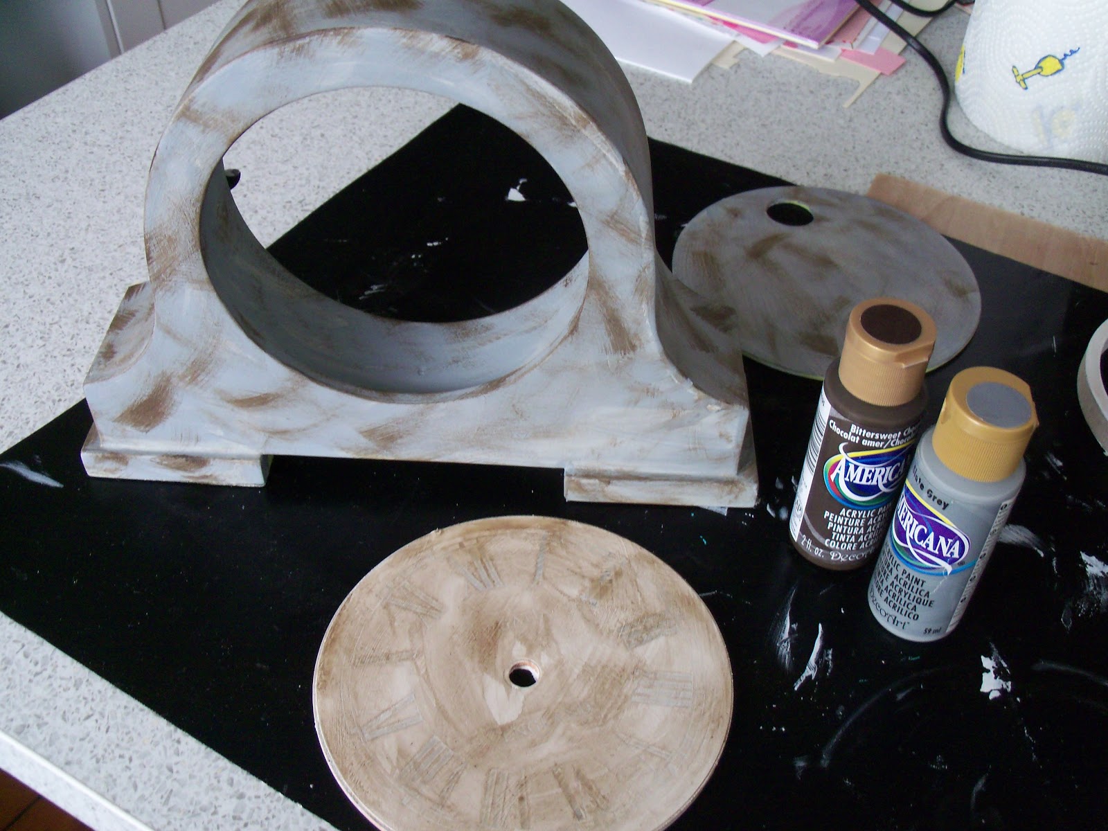
These are the raw materials, I'm not sure where the frame came from; it was sitting on my shelf, calling to me!!
 
Once I had decided that it was a Gone with the Wind theme, I cut out some areas of the papers, and I used a couple of the stamps in some areas. 

 
I painted up the frame (papier mache sort of thing) in my favourite Decoarts Americana, a lovely brown called bittersweet chocolate.  I then embossed the 'Memories' word from the stamp set, using Distress embossing powder (fired brick) at the top, and clear at the bottom.  My aim was to have the top one more vibrant with the bottom one fading, like memories do - symbolic, huh?!

 top version
bottom version 
 
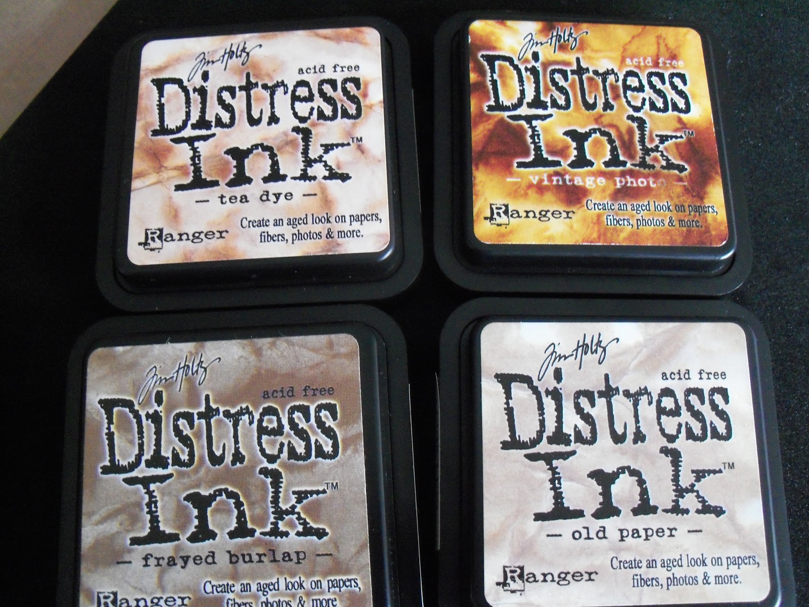
Here's a close up of the map section.  I used the cling words stamp in vintage photo (second generation stamp) 
 
Last week, sometime, I got an update on Gone With the Wind, and this photo was used.  It stuck in my head.  I printed it off as my centrepiece.  I used the same stamp, but only inked up a small portion, the bit that said respect and culture, using a DI Marker pen, in vintage photo again.  Seemed to fit with Rhett (in my humble opinion).

 
Then I assembled it all, inking the edges of most of the pieces with DI vintage photo.  I used some of the flowers from the matching embellishments, along with one of the gem swirls. I used one of the idea-ology dog tags (cherish).  I cut out one of the pocket watches from the 6x6 pad, and glazed it with glossy accents.
I cut out the key from one of the papers, and triple embossed it, to make it pop.  I stamped the journalling block from the stamp set in vintage photo, and used an embossing pen to write the eternal quote, 'Tomorrow is another day...'  The quality of the paper pack is amazing, it was really difficult to 'ruffle' the dollar bill, it wanted to crease more than ruffle!  Inked again with vintage photo.  I added three of the wired flowers underneath the bill, and added a stamped butterfly, as well as an embellishment one, to reflect the one stamped on the journalling block (you can just about make that out, under the dollar bill).


Next, a cup of coffee, a box of tissues and the movie, I think!!  Quite frankly, my dear, I do give a damn!!